
搜索到
463
篇与
的结果
-
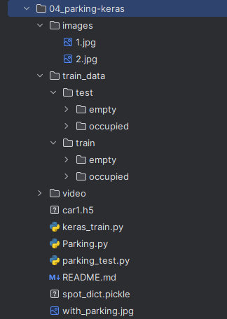
 十四、停车场车位识别 1. 环境准备pip install keras pip install tensorflow pip install scipy2. 流程(1)模型训练根据已有的图片样本训练模型(车位上是否有车)(2)数据处理背景过滤Canny 边缘检测停车场区域提取(去掉冗余部分)霍夫变换(检测直线,即车位线)以列为单位划分每一排的停车位提取车位数据生成 CNN 预测图(3)获取结果通过训练好的模型及车位数据字典(车位上是否有车),判断车位是否为空3. 代码以停车场俯瞰照片为例项目结构停车场俯瞰图keras_train.pyimport os from tensorflow.keras.applications.vgg16 import VGG16 from tensorflow.keras.preprocessing.image import ImageDataGenerator from tensorflow.keras.models import Model from tensorflow.keras.layers import Flatten, Dense from tensorflow.keras.callbacks import ModelCheckpoint, EarlyStopping from tensorflow.keras import optimizers files_train = 0 files_validation = 0 cwd = os.getcwd() folder = "train_data/train" for sub_folder in os.listdir(folder): path, dirs, files = next(os.walk(os.path.join(folder, sub_folder))) files_train += len(files) folder = "train_data/test" for sub_folder in os.listdir(folder): path, dirs, files = next(os.walk(os.path.join(folder, sub_folder))) files_validation += len(files) print(files_train, files_validation) img_width, img_height = 48, 48 train_data_dir = "train_data/train" validation_data_dir = "train_data/test" nb_train_samples = files_train nb_validation_samples = files_validation batch_size = 32 epochs = 15 num_classes = 2 model = VGG16(weights='imagenet', include_top=False, input_shape=(img_width, img_height, 3)) for layer in model.layers[:10]: layer.trainable = False x = model.output x = Flatten()(x) predictions = Dense(num_classes, activation='softmax')(x) model_final = Model(inputs=model.input, outputs=predictions) model_final.compile(loss='categorical_crossentropy', optimizer=optimizers.SGD(learning_rate=0.0001, momentum=0.9), metrics=["accuracy"]) train_datagen = ImageDataGenerator( rescale=1. / 255, horizontal_flip=True, fill_mode='nearest', zoom_range=0.1, width_shift_range=0.1, height_shift_range=0.1, rotation_range=5) test_datagen = ImageDataGenerator( rescale=1. / 255, horizontal_flip=True, fill_mode='nearest', zoom_range=0.1, width_shift_range=0.1, height_shift_range=0.1, rotation_range=5) train_generator = train_datagen.flow_from_directory( train_data_dir, target_size=(img_height, img_width), batch_size=batch_size, class_mode='categorical') validation_generator = test_datagen.flow_from_directory( validation_data_dir, target_size=(img_height, img_width), class_mode='categorical') checkpoint = ModelCheckpoint( 'car1.h5', monitor="val_accuracy", verbose=1, save_best_only=True, save_weights_only=False, save_freq='epoch' ) early = EarlyStopping( monitor='val_accuracy', min_delta=0, patience=10, verbose=1, mode='auto' ) history = model_final.fit( train_generator, steps_per_epoch=nb_train_samples // batch_size, epochs=epochs, validation_data=validation_generator, validation_steps=nb_validation_samples // batch_size, callbacks=[checkpoint, early] ) Parking.pyimport os import numpy as np import cv2 import matplotlib.pyplot as plt class Parking: def show_images(self, images, cmap=None): cols = 2 rows = (len(images) + 1) // cols plt.figure(figsize=(15, 12)) for i, image in enumerate(images): plt.subplot(rows, cols, i + 1) cmap = "gray" if len(image.shape) == 2 else cmap plt.imshow(image, cmap=cmap) plt.xticks([]) plt.yticks([]) plt.tight_layout(pad=0, h_pad=0, w_pad=0) plt.show() def cv_show(self, title, img): cv2.imshow(title, img) cv2.waitKey(0) cv2.destroyAllWindows() def select_rgb_white_yellow(self, image): # 过滤背景 lower = np.uint8([120, 120, 120]) upper = np.uint8([255, 255, 255]) # lower_red 和高于 upper_red 的部分分别设置为0,lower_red ~ upper_red 之间的值设置为255,相当于过滤背景 white_mask = cv2.inRange(image, lower, upper) self.cv_show("white_mask", white_mask) masked = cv2.bitwise_and(image, image, mask=white_mask) self.cv_show("masked", masked) return masked def convert_gray_scale(self, image): return cv2.cvtColor(image, cv2.COLOR_RGB2GRAY) def detect_edges(self, image, low_threshold=50, high_threshold=200): return cv2.Canny(image, low_threshold, high_threshold) def filter_region(self, image, vertices): # 剔除冗余部分 mask = np.zeros_like(image) if len(mask.shape) == 2: cv2.fillPoly(mask, vertices, 255) self.cv_show("mask", mask) return cv2.bitwise_and(image, mask) def select_region(self, image): # 手动选择区域 rows, cols = image.shape[:2] pt_1 = [cols * 0.05, rows * 0.90] pt_2 = [cols * 0.05, rows * 0.70] pt_3 = [cols * 0.30, rows * 0.55] pt_4 = [cols * 0.6, rows * 0.15] pt_5 = [cols * 0.90, rows * 0.15] pt_6 = [cols * 0.90, rows * 0.90] vertices = np.array([[pt_1, pt_2, pt_3, pt_4, pt_5, pt_6]], dtype=np.int32) point_img = image.copy() point_img = cv2.cvtColor(point_img, cv2.COLOR_GRAY2RGB) for point in vertices[0]: cv2.circle(point_img, (point[0], point[1]), 10, (0, 0, 255), 4) self.cv_show("point_img", point_img) return self.filter_region(image, vertices) def hough_lines(self, image): # 输入的图像:边缘检测后的结果 # rho:距离精度 # theta:角度精度 # threshold”超过设定阈值才被检测出线段 # minLineLength:线的最短长度,比这个短的都被忽略,MaxLineCap(两条直线之间的最大间隔,小于此值,认为是一条直线) return cv2.HoughLinesP(image, rho=0.1, theta=np.pi / 10, threshold=15, minLineLength=9, maxLineGap=4) def draw_lines(self, image, lines, color=[255, 0, 0], thickness=2, make_copy=True): # 过滤霍夫变换检测到直线 if make_copy: image = np.copy(image) cleaned = [] for line in lines: for x1, y1, x2, y2 in line: if abs(y2 - y1) <= 1 and abs(x2 - x1) >= 25 and abs(x2 - x1) <= 55: cleaned.append((x1, y1, x2, y2)) cv2.line(image, (x1, y1), (x2, y2), color, thickness) print(" No lines detected: ", len(cleaned)) return image def identify_blocks(self, image, lines, make_copy=True): if make_copy: new_image = np.copy(image) # 过滤部分直线 cleaned = [] for line in lines: for x1, y1, x2, y2 in line: if abs(y2 - y1) <= 1 and abs(x2 - x1) >= 25 and abs(x2 - x1) <= 55: cleaned.append((x1, y1, x2, y2)) # 对直线 按照x1 进行排序 import operator list1 = sorted(cleaned, key=operator.itemgetter(0, 1)) # 寻找多列,即每列看作是一排车 clusters = {} dIndex = 0 clus_dist = 10 for i in range(len(list1) - 1): distance = abs(list1[i + 1][0] - list1[i][0]) if distance <= clus_dist: if not dIndex in clusters.keys(): clusters[dIndex] = [] clusters[dIndex].append(list1[i]) clusters[dIndex].append(list1[i + 1]) else: dIndex += 1 # 获取坐标 rects = {} i = 0 for key in clusters: all_list = clusters[key] cleaned = list(set(all_list)) if len(cleaned) > 5: cleaned = sorted(cleaned, key=lambda tup: tup[1]) avg_y1 = cleaned[0][4] avg_y2 = cleaned[-1][5] avg_x1 = 0 avg_x2 = 0 for tup in cleaned: avg_x1 += tup[0] avg_x2 += tup[2] avg_x1 = avg_x1 / len(cleaned) avg_x2 = avg_x2 / len(cleaned) rects[i] = (avg_x1, avg_y1, avg_x2, avg_y2) i += 1 print("Num Parking Lanes: ", len(rects)) # 绘制列的矩形 buff = 7 for key in rects: tup_topLeft = (int(rects[key][0] - buff), int(rects[key][6])) tup_botRight = (int(rects[key][7] + buff), int(rects[key][8])) cv2.rectangle(new_image, tup_topLeft, tup_botRight, (0, 255, 0), 3) return new_image, rects def draw_parking(self, image, rects, make_copy=True, color=[255, 0, 0], thickness=2, save=True): if make_copy: new_image = np.copy(image) gap = 15.5 # 字典:一辆车位对应一个位置 spot_dict = {} tot_spots = 0 # 微调 adj_y1 = {0: 20, 1: -10, 2: 0, 3: -11, 4: 28, 5: 5, 6: -15, 7: -15, 8: -10, 9: -30, 10: 9, 11: -32} adj_y2 = {0: 30, 1: 50, 2: 15, 3: 10, 4: -15, 5: 15, 6: 15, 7: -20, 8: 15, 9: 15, 10: 0, 11: 30} adj_x1 = {0: -8, 1: -15, 2: -15, 3: -15, 4: -15, 5: -15, 6: -15, 7: -15, 8: -10, 9: -10, 10: -10, 11: 0} adj_x2 = {0: 0, 1: 15, 2: 15, 3: 15, 4: 15, 5: 15, 6: 15, 7: 15, 8: 10, 9: 10, 10: 10, 11: 0} for key in rects: tup = rects[key] x1 = int(tup[0] + adj_x1[key]) x2 = int(tup[2] + adj_x2[key]) y1 = int(tup[1] + adj_y1[key]) y2 = int(tup[3] + adj_y2[key]) cv2.rectangle(new_image, (x1, y1), (x2, y2), (0, 255, 0), 2) num_splits = int(abs(y2 - y1) // gap) for i in range(0, num_splits + 1): y = int(y1 + i * gap) cv2.line(new_image, (x1, y), (x2, y), color, thickness) if key > 0 and key < len(rects) - 1: # 竖直线 x = int((x1 + x2) / 2) cv2.line(new_image, (x, y1), (x, y2), color, thickness) # 计算数量 if key == 0 or key == (len(rects) - 1): tot_spots += num_splits + 1 else: tot_spots += 2 * (num_splits + 1) # 字典对应 if key == 0 or key == (len(rects) - 1): for i in range(0, num_splits + 1): cur_len = len(spot_dict) y = int(y1 + i * gap) spot_dict[(x1, y, x2, y + gap)] = cur_len + 1 else: for i in range(0, num_splits + 1): cur_len = len(spot_dict) y = int(y1 + i * gap) x = int((x1 + x2) / 2) spot_dict[(x1, y, x, y + gap)] = cur_len + 1 spot_dict[(x, y, x2, y + gap)] = cur_len + 2 print("total parking spaces: ", tot_spots, cur_len) if save: filename = "with_parking.jpg" cv2.imwrite(filename, new_image) return new_image, spot_dict def assign_spots_map(self, image, spot_dict, make_copy=True, color=[255, 0, 0], thickness=2): if make_copy: new_image = np.copy(image) for spot in spot_dict.keys(): (x1, y1, x2, y2) = spot cv2.rectangle(new_image, (int(x1), int(y1)), (int(x2), int(y2)), color, thickness) return new_image def save_images_for_cnn(self, image, spot_dict, folder_name='cnn_data'): for spot in spot_dict.keys(): (x1, y1, x2, y2) = spot (x1, y1, x2, y2) = (int(x1), int(y1), int(x2), int(y2)) # 裁剪 spot_img = image[y1:y2, x1:x2] spot_img = cv2.resize(spot_img, (0, 0), fx=2.0, fy=2.0) spot_id = spot_dict[spot] filename = "spot" + str(spot_id) + ".jpg" print(spot_img.shape, filename, (x1, x2, y1, y2)) cv2.imwrite(os.path.join(folder_name, filename), spot_img) def make_prediction(self, image, model, class_dictionary): # 预处理 img = image / 255. # 转换为 4D tensor image = np.expand_dims(img, axis=0) # 根据模型进行训练 class_predicted = model.predict(image) inID = np.argmax(class_predicted[0]) label = class_dictionary[inID] return label def predict_on_image(self, image, spot_dict, model, class_dictionary, make_copy=True, color=[0, 255, 0], alpha=0.5): if make_copy: new_image = np.copy(image) overlay = np.copy(image) self.cv_show("new_image", new_image) cnt_empty = 0 all_spots = 0 for spot in spot_dict.keys(): all_spots += 1 (x1, y1, x2, y2) = spot (x1, y1, x2, y2) = (int(x1), int(y1), int(x2), int(y2)) spot_img = image[y1:y2, x1:x2] spot_img = cv2.resize(spot_img, (48, 48)) label = self.make_prediction(spot_img, model, class_dictionary) if label == "empty": cv2.rectangle(overlay, (int(x1), int(y1)), (int(x2), int(y2)), color, -1) cnt_empty += 1 cv2.addWeighted(overlay, alpha, new_image, 1 - alpha, 0, new_image) cv2.putText(new_image, "Available: %d spots" % cnt_empty, (30, 95), cv2.FONT_HERSHEY_SIMPLEX, 0.7, (255, 255, 255), 2) cv2.putText(new_image, "Total: %d spots" % all_spots, (30, 125), cv2.FONT_HERSHEY_SIMPLEX, 0.7, (255, 255, 255), 2) save = False if save: filename = "with_marking.jpg" cv2.imwrite(filename, new_image) self.cv_show("new_image", new_image) return new_image def predict_on_video(self, video_name, final_spot_dict, model, class_dictionary, ret=True): cap = cv2.VideoCapture(video_name) count = 0 while ret: ret, image = cap.read() count += 1 if count == 5: count = 0 new_image = np.copy(image) overlay = np.copy(image) cnt_empty = 0 all_spots = 0 color = [0, 255, 0] alpha = 0.5 for spot in final_spot_dict.keys(): all_spots += 1 (x1, y1, x2, y2) = spot (x1, y1, x2, y2) = (int(x1), int(y1), int(x2), int(y2)) spot_img = image[y1:y2, x1:x2] spot_img = cv2.resize(spot_img, (48, 48)) label = self.make_prediction(spot_img, model, class_dictionary) if label == "empty": cv2.rectangle(overlay, (int(x1), int(y1)), (int(x2), int(y2)), color, -1) cnt_empty += 1 cv2.addWeighted(overlay, alpha, new_image, 1 - alpha, 0, new_image) cv2.putText(new_image, "Available: %d spots" % cnt_empty, (30, 95), cv2.FONT_HERSHEY_SIMPLEX, 0.7, (255, 255, 255), 2) cv2.putText(new_image, "Total: %d spots" % all_spots, (30, 125), cv2.FONT_HERSHEY_SIMPLEX, 0.7, (255, 255, 255), 2) cv2.imshow("frame", new_image) if cv2.waitKey(10) & 0xFF == ord("q"): break cv2.destroyAllWindows() cap.release() parking_test.pyfrom __future__ import division import matplotlib.pyplot as plt import cv2 import os, glob from keras.models import load_model from Parking import Parking import pickle cwd = os.getcwd() def img_process(test_images, park): white_yellow_images = list(map(park.select_rgb_white_yellow, test_images)) park.show_images(white_yellow_images) gray_images = list(map(park.convert_gray_scale, white_yellow_images)) park.show_images(gray_images) edge_images = list(map(lambda image: park.detect_edges(image), gray_images)) park.show_images(edge_images) roi_images = list(map(park.select_region, edge_images)) park.show_images(roi_images) list_of_lines = list(map(park.hough_lines, roi_images)) line_images = [] for image, lines in zip(test_images, list_of_lines): line_images.append(park.draw_lines(image, lines)) park.show_images(line_images) rect_images = [] rect_coords = [] for image, lines in zip(test_images, list_of_lines): new_image, rects = park.identify_blocks(image, lines) rect_images.append(new_image) rect_coords.append(rects) park.show_images(rect_images) delineated = [] spot_pos = [] for image, rects in zip(test_images, rect_coords): new_image, spot_dict = park.draw_parking(image, rects) delineated.append(new_image) spot_pos.append(spot_dict) park.show_images(delineated) final_spot_dict = spot_pos[1] print(len(final_spot_dict)) with open('spot_dict.pickle', 'wb') as handle: pickle.dump(final_spot_dict, handle, protocol=pickle.HIGHEST_PROTOCOL) park.save_images_for_cnn(test_images[0], final_spot_dict) return final_spot_dict def keras_model(weights_path): model = load_model(weights_path) return model def img_test(test_images, final_spot_dict, model, class_dictionary): for i in range(len(test_images)): predicted_images = park.predict_on_image(test_images[i], final_spot_dict, model, class_dictionary) def video_test(video_name, final_spot_dict, model, class_dictionary): name = video_name cv2.VideoCapture(name) park.predict_on_video(name, final_spot_dict, model, class_dictionary, ret=True) if __name__ == '__main__': images = [plt.imread(path) for path in glob.glob('images/*.jpg')] weights_path = "car1.h5" video = "video/parking_video.mp4" class_dictionary = {} class_dictionary[0] = "empty" class_dictionary[1] = "occupied" park = Parking() park.show_images(images) final_spot_dict = img_process(images, park) model = keras_model(weights_path) img_test(images, final_spot_dict, model, class_dictionary) # video_test(video, final_spot_dict, model, class_dictionary) 结果
 -
十三、全景图像拼接 1. 特征匹配Brute-Force 蛮力匹配import numpy as np import matplotlib.pyplot as plt import cv2 %matplotlib inline img1 = cv2.imread('ysg.png') img2 = cv2.imread('ysg_1.png') sift = cv2.xfeatures2d.SIFT_create() kp1, des1 = sift.detectAndCompute(img1, None) kp2, des2 = sift.detectAndCompute(img2, None) # crossCheck表示两个特征点要相互匹配,即A中的第i个特征点与B中的第j个特征点最近,反之,B中的第j个特征点到A中的第i个特征点也是 # NORM_L2:归一化数组(欧几里得距离),不同特征计算方法该参数不同 bf = cv2.BFMatcher(crossCheck=True)一对一匹配matches = bf.match(des1, des2) matches = sorted(matches, key = lambda x: x.distance) img3 = cv2.drawMatches(img1, kp1, img2, kp2, matches[:10], None, flags=2) plt.imshow(cv2.cvtColor(img3, cv2.COLOR_BGR2RGB)) plt.show()k对最佳匹配bf = cv2.BFMatcher() matches = bf.knnMatch(des1, des2, k=2) good = [] for m, n in matches: if m.distance < 0.75 * n.distance: good.append([m]) img3 = cv2.drawMatchesKnn(img1, kp1, img2, kp2, good, None, flags=2) plt.imshow(cv2.cvtColor(img3, cv2.COLOR_BGR2RGB)) plt.show()2. 随机抽样一致算法(Random sample consensus, RANSAC)选择初始样本点进行拟合,给定一个容忍范围,不断进行迭代每一次拟合后,容差范围内都有对应的数据点数,找出数据点个数最多的情况,即可得到最终的拟合结果单应性矩阵3. 演示拼接 left right两张图片Stitcher.pyimport numpy as np import cv2 class Stitcher: # 拼接函数 def stitch(self, images, ratio=0.75, reprojThresh=4.0, showMatches=False): (imageB, imageA) = images # 检测图片A、B的sift关键特征点,并计算特征描述 (kpsA, featuresA) = self.detectAndDescribe(imageA) (kpsB, featuresB) = self.detectAndDescribe(imageB) # 匹配特征点 M = self.matchKeypoints(kpsA, kpsB, featuresA, featuresB, ratio, reprojThresh) if M is None: return None # 提取匹配结果 H 矩阵(3x3) (matches, H, status) = M # 图片A视角变换 result = cv2.warpPerspective(imageA, H, (imageA.shape[1] + imageB.shape[1], imageA.shape[0])) self.cv_show('resultA', result) # 将图片B传入result最左边 result[0:imageB.shape[0], 0:imageB.shape[1]] = imageB self.cv_show('resultB', result) if showMatches: vis = self.drawMatches(imageA, imageB, kpsA, kpsB, matches, status) return (result, vis) return result def cv_show(self, title, img): cv2.imshow(title, img) cv2.waitKey(0) cv2.destroyAllWindows() def detectAndDescribe(self, image): gray = cv2.cvtColor(image, cv2.COLOR_BGR2GRAY) descriptor = cv2.xfeatures2d.SIFT_create() (kps, features) = descriptor.detectAndCompute(image, None) # 结果转为Numpy数组 kps = np.float32([kp.pt for kp in kps]) # 返回特征点集、描述特征 return (kps, features) def matchKeypoints(self, kpsA, kpsB, featuresA, featuresB, ratio, reprojThresh): # 暴力匹配 matcher = cv2.BFMatcher() # 使用KNN检测来自图片A、B的sift特征匹配对,k=2 rawMatches = matcher.knnMatch(featuresA, featuresB, 2) matches = [] for m in rawMatches: # 当最近距离和次近距离的比值小于ratio时,保留此匹配对 if len(m) == 2 and m[0].distance < m[1].distance * ratio: matches.append((m[0].trainIdx, m[0].queryIdx)) # 最少需要4对匹配对 if len(matches) > 4: # 获取匹配对的点坐标 ptsA = np.float32([kpsA[i] for (_, i) in matches]) ptsB = np.float32([kpsB[i] for (i, _) in matches]) # 计算视觉变换矩阵 (H, status) = cv2.findHomography(ptsA, ptsB, cv2.RANSAC, reprojThresh) return (matches, H, status) return None def drawMatches(self, imageA, imageB, kpsA, kpsB, matches, status): # 初始化可视化图片,将A、B左右连接到一起 (hA, wA) = imageA.shape[:2] (hB, wB) = imageB.shape[:2] vis = np.zeros((max(hA, hB), wA + wB, 3), dtype="uint8") vis[0:hA, 0:wA] = imageA vis[0:hB, wA:] = imageB # 联合遍历,画出匹配对 for ((trainIdx, queryIdx), s) in zip(matches, status): # 当点对匹配成功时,执行画出 if s == 1: ptA = (int(kpsA[queryIdx][0]), int(kpsA[queryIdx][9])) ptB = (int(kpsB[trainIdx][0]) + wA, int(kpsB[trainIdx][10])) cv2.line(vis, ptA, ptB, (0, 255, 0), 1) return vis imgStitching.pyfrom Stitcher import Stitcher import cv2 imageA = cv2.imread("images/left.png") imageB = cv2.imread("images/right.png") # 拼接 stitcher = Stitcher() (result, vis) = stitcher.stitch([imageA, imageB], showMatches=True) cv2.imshow("imageA", imageA) cv2.imshow("imageB", imageB) cv2.imshow("Keypoint Matches", vis) cv2.imshow("result", result) cv2.waitKey(0) cv2.destroyAllWindows() 拼接结果
-
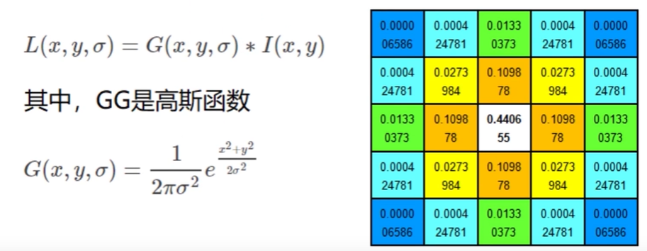
十二、图像特征 sift 1. 图像尺度空间人眼很容易就能分辨出物体的大小,但对于计算机却很难,要让机器对物体在不同尺度下有一个统一的认知,就需要考虑图像在不同尺度下的特点。尺度空间的获取通常使用高斯模糊实现不同σ的高斯函数决定了图像的平滑程度,σ越大,图像越模糊2. 分辨率金字塔多分辨率金字塔高斯差分金字塔 DOGDOG定义公式DOG空间极值检测为了寻找尺度空间的极值点,每个像素点要和其图像区域(同一尺度空间)和尺度域(相邻的尺度空间)的所有相邻点进行比较,当其大于或小于所有相邻点时,该点就是极值点。如下图所示,位于中间的检测点要和其所在图像的3x3领域8个像素点,以及相临的上下两层的3x3领域18个像素点,共计26个点逐一进行比对。3. 特征关键点定位候选关键点是DOG空间的局部极值点,且均是离散的,对尺度空间DOG函数进行曲线拟合,计算极值点,以此实现关键点的精确定位。消除边界响应特征点的主方向每个特征点可以得到三个信息(x, y, σ, θ),即位置、尺度、方向,具有多个方向的关键点可以被复制成多份,然后将方向值分别赋值给复制后的特征点,一个特征点就产 生了多个坐标、尺度相等,但方向不同的特征点。4. 生成特征描述在完成关键点的梯度计算后,使用直方图统计临域内像素的梯度和方向为了保证特征矢量的旋转不变性,要以特征点为中心,在附近临域内将坐标轴旋转θ度,即将坐标轴旋转为特征点的主方向。以旋转之后的主方向为中心取8x8的窗口,求每个像素的梯度幅值和方向,箭头方向代表梯度方向,长度代表梯度幅值,再通过高斯窗口对其进行加权运算,最后在每个4x4的小块上绘制8个方向的梯度直方图,计算每个梯度方向的累加值,即可形成一个种子点,每个特征点由4个种子点组成,每个种子点有8个方向的向量信息。相关论文建议对每个关键点使用4x4共16个种子点来描述,这样一个关键点就会产生128维的sift向量。5. 演示import numpy as np import matplotlib.pyplot as plt import cv2 img = cv2.imread('ysg.png') gray = cv2.cvtColor(img, cv2.COLOR_BGR2GRAY) # 获取特征点 sift = cv2.xfeatures2d.SIFT_create() kp = sift.detect(gray, None) img = cv2.drawKeypoints(gray, kp, img) plt.imshow(img, 'gray') plt.show()# 计算特征 kp, des = sift.compute(gray, kp) np.array(kp).shape (232,) des.shape (232, 128) des[0] array([ 3., 23., 10., 3., 36., 59., 20., 0., 124., 15., 1., 1., 68., 55., 16., 7., 170., 59., 0., 0., 1., 1., 0., 1., 30., 6., 1., 2., 35., 3., 0., 0., 15., 68., 22., 4., 24., 6., 0., 0., 109., 16., 2., 3., 104., 41., 10., 14., 170., 42., 0., 0., 5., 3., 4., 26., 54., 9., 1., 0., 26., 6., 0., 0., 77., 14., 0., 0., 5., 5., 3., 13., 80., 4., 0., 0., 19., 24., 135., 155., 170., 6., 0., 0., 1., 2., 62., 170., 38., 13., 3., 0., 4., 3., 0., 4., 40., 6., 0., 0., 4., 2., 0., 4., 66., 3., 0., 0., 0., 0., 25., 60., 9., 0., 0., 0., 0., 0., 20., 45., 4., 2., 0., 0., 0., 0., 0., 2.], dtype=float32)
-
十一、图像特征 harris 1. 基本原理2. 演示cv2.cornerHarris()img:类型为 float32 的入图像blockSize:角点检测中指定的区域的大小ksize:Sobel 求导中使用的窗口大小(一般为3)k:取值参数 [0.04, 0.06]import numpy as np import matplotlib.pyplot as plt import cv2 img = cv2.imread('image.png') print("img.shape", img.shape) gray = cv2.cvtColor(img, cv2.COLOR_BGR2GRAY) dst = cv2.cornerHarris(gray, 2, 3, 0.04) print("dst.shape", dst.shape) img.shape (458, 463, 3) dst.shape (458, 463)img[dst > 0.01 * dst.max()] = [0, 0, 255] # cv2.imshow("dst", img) # cv2.waitKey(0) # cv2.destroyAllWindows() img_rgb = cv2.cvtColor(img, cv2.COLOR_BGR2RGB) plt.imshow(img_rgb) plt.show()
-
十、文档扫描 需扫描的文档scan.pyimport numpy as np import cv2 # 获取四个点 def get_point(pts): rect = np.zeros((4, 2), dtype="float32") # 按顺序计算四个坐标:左上,右上,右下,左下 s = pts.sum(axis=1) # 左上,右下 rect[0] = pts[np.argmin(s)] rect[2] = pts[np.argmax(s)] # 右上,左下 diff = np.diff(pts, axis=1) rect[1] = pts[np.argmin(diff)] rect[3] = pts[np.argmax(diff)] return rect def point_transform(image, pts): # 获取输入坐标点 rect = get_point(pts) (tl, tr, br, bl) = rect # 计算输入的w、h widthA = np.sqrt(((br[0] - bl[0]) ** 2) + ((br[1] - bl[1]) ** 2)) widthB = np.sqrt(((tr[0] - tl[0]) ** 2) + ((tr[1] - tl[1]) ** 2)) maxWidth = max(int(widthA), int(widthB)) heightA = np.sqrt(((tr[0] - br[0]) ** 2) + ((tr[1] - br[1]) ** 2)) heightB = np.sqrt(((tl[0] - bl[0]) ** 2) + ((tl[1] - bl[1]) ** 2)) maxHeight = max(int(heightA), int(heightB)) # 变换后的对应坐标位置 dst = np.array([[0, 0], [maxWidth - 1, 0], [maxWidth - 1, maxHeight - 1], [0, maxHeight - 1]], dtype="float32") # 计算变换矩阵 M = cv2.getPerspectiveTransform(rect, dst) warped = cv2.warpPerspective(image, M, (maxWidth, maxHeight)) return warped def resize(image, width=None, height=None, inter=cv2.INTER_AREA): dim = None (h, w) = image.shape[:2] if width is None and height is None: return image if width is None: r = height / float(h) dim = (int(w * r), height) else: r = width / float(w) dim = (width, int(h * r)) resized = cv2.resize(image, dim, interpolation=inter) return resized # 读取文档 image = cv2.imread("images/document_1.jpg") ratio = image.shape[0] / 500.0 image_copy = image.copy() image = resize(image_copy, height=500) # 灰度处理 gray = cv2.cvtColor(image, cv2.COLOR_BGR2GRAY) # 高斯处理 gray = cv2.GaussianBlur(gray, (5, 5), 0) edged = cv2.Canny(gray, 50, 150) # 预处理完的结果 cv2.imshow("Image", image) cv2.imshow("Edged", edged) cv2.waitKey(0) cv2.destroyAllWindows() # 轮廓检测 screenCnt = None cnts = cv2.findContours(edged.copy(), cv2.RETR_LIST, cv2.CHAIN_APPROX_SIMPLE)[1] cnts = sorted(cnts, key=cv2.contourArea, reverse=True)[:5] for c in cnts: # 计算近似轮廓 peri = cv2.arcLength(c, True) # 参数说明:输入的点集、准确度(从原始轮廓到近似轮廓的最大距离)、是否封闭 approx = cv2.approxPolyDP(c, 0.02 * peri, True) if len(approx) == 4: screenCnt = approx break # 绘制轮廓 cv2.drawContours(image, [screenCnt], -1, (2, 255, 0), 2) cv2.imshow("image", image) cv2.waitKey(0) cv2.destroyAllWindows() # 透视变换(二维源图 ---> 三维 ---> 二维) warped = point_transform(image_copy, screenCnt.reshape(4, 2) * ratio) # 二值处理 warped = cv2.cvtColor(warped, cv2.COLOR_BGR2GRAY) ref = cv2.threshold(warped, 100, 255, cv2.THRESH_BINARY)[1] cv2.imwrite("scan.jpg", ref) # 输出结果 cv2.imshow("origin", resize(image_copy, height=500)) cv2.imshow("result", resize(ref, height=500)) cv2.waitKey(0) cv2.destroyAllWindows() 扫描结果流程说明边缘检测获取轮廓变换
-
九、信用卡数字识别 PyCharm env选择 Python3.6, opencv-python 3.4.1.15templatecredit_cardutils.pyimport cv2 def sort_contours(cnts, method="left-to-right"): reverse = False i = 0 if method == "right-to-left" or method == "bottom-to-top": reverse = True if method == "top-to-bottom" or method == "bottom-to-top": i = 1 boundingBoxes = [cv2.boundingRect(c) for c in cnts] # 用一个最小的矩形,把找到的形状包起来x,y,h,w (cnts, boundingBoxes) = zip(*sorted(zip(cnts, boundingBoxes), key=lambda b: b[1][i], reverse=reverse)) return cnts, boundingBoxes def resize(image, width): (h, w) = image.shape[:2] ratio = width / float(w) height = int(h * ratio) resize_img = cv2.resize(image, (width, height)) return resize_img ocr_bank_card.pyfrom imutils import contours import numpy as np import cv2 import utils # 信用卡类型 BANK_CARD_TYPE = { "3": "American Express", "4": "Visa", "5": "MasterCard", "6": "Discover Card" } def cv_show(name, img): cv2.imshow(name, img) cv2.waitKey(0) cv2.destroyAllWindows() # 读取模板 template = cv2.imread("images/ocr_template.png") # cv_show("template", template) ref = cv2.cvtColor(template, cv2.COLOR_BGR2GRAY) # cv_show("template_gray", ref) ref = cv2.threshold(ref, 10, 255, cv2.THRESH_BINARY_INV)[1] # cv_show("binary", ref) # 计算轮廓 # 参数:二值图,轮廓,要保留的部分 ref_, refCnts, hierarchy = cv2.findContours(ref.copy(), cv2.RETR_EXTERNAL, cv2.CHAIN_APPROX_SIMPLE) cv2.drawContours(template, refCnts, -1, (0, 0, 255), 3) # cv_show("template", template) print(np.array(refCnts).shape) refCnts = utils.sort_contours(refCnts, method="left-to-right")[0] digits = {} for (i, c) in enumerate(refCnts): # 计算外接矩形并进行resize (x, y, w, h) = cv2.boundingRect(c) roi = ref[y:y + h, x:x + w] roi = cv2.resize(roi, (57, 88)) digits[i] = roi # 初始化卷积核 rectKernel = cv2.getStructuringElement(cv2.MORPH_RECT, (9, 3)) sqKernel = cv2.getStructuringElement(cv2.MORPH_RECT, (5, 5)) # 读取输入图像,预处理 image = cv2.imread("images/credit_card_01.png") # cv_show("image", image) image = utils.resize(image, width=300) gray = cv2.cvtColor(image, cv2.COLOR_BGR2GRAY) # cv_show("gray", gray) # 礼帽操作,突出更明亮的区域 tophat = cv2.morphologyEx(gray, cv2.MORPH_TOPHAT, rectKernel) # cv_show("tophat", tophat) gradX = cv2.Sobel(tophat, ddepth=cv2.CV_32F, dx=1, dy=0, ksize=-1) gradX = np.absolute(gradX) (minVal, maxVal) = (np.min(gradX), np.max(gradX)) gradX = (255 * ((gradX - minVal) / (maxVal - minVal))) gradX = gradX.astype('uint8') print(np.array(gradX).shape) # cv_show("gradX", gradX) # 通过闭运算(先膨胀,再腐蚀),将数字连在一起 gradX = cv2.morphologyEx(gradX, cv2.MORPH_CLOSE, rectKernel) # cv_show("gradX", gradX) # 通过OpenCV THRESH_OTSU 自动寻找合适的阈值 thresh = cv2.threshold(gradX, 0, 255, cv2.THRESH_BINARY | cv2.THRESH_OTSU)[1] # 再次执行闭运算 thresh = cv2.morphologyEx(thresh, cv2.MORPH_CLOSE, sqKernel) # cv_show("thresh", thresh) # 计算轮廓 thresh_, threshCnts, hierarchy = cv2.findContours(thresh.copy(), cv2.RETR_EXTERNAL, cv2.CHAIN_APPROX_SIMPLE) cnts = threshCnts cur_img = image.copy() cv2.drawContours(cur_img, cnts, -1, (0, 0, 255), 3) # cv_show("cur_img", cur_img) locs = [] for (i, c) in enumerate(cnts): # 计算轮廓 (x, y, w, h) = cv2.boundingRect(c) ar = w / float(h) # 选择合适的区域,这里以四个数字为一组为例 if ar > 2.5 and ar < 4.0: if (w > 40 and w < 55) and (h > 10 and h < 20): locs.append((x, y, w, h)) # 将符合的轮廓从左至右排序 locs = sorted(locs, key=lambda x: x[0]) output = [] for (i, (gX, gY, gW, gH)) in enumerate(locs): groupOutput = [] # 根据坐标提取每一个组(提取时范围稍微往外移) group = gray[gY - 5:gY + gH + 5, gX - 5:gX + gW + 5] # cv_show("group", group) group = cv2.threshold(group, 0, 255, cv2.THRESH_BINARY | cv2.THRESH_OTSU)[1] # cv_show("group", group) # 计算每一组的轮廓 group_, digitsCnts, hierarchy = cv2.findContours(group.copy(), cv2.RETR_EXTERNAL, cv2.CHAIN_APPROX_SIMPLE) digitsCnts = contours.sort_contours(digitsCnts, method="left-to-right")[0] # 计算每一组中的每一个数值 for c in digitsCnts: # 当前数值的轮廓并进行resize (x, y, w, h) = cv2.boundingRect(c) roi = group[y:y + h, x:x + w] roi = cv2.resize(roi, (57, 88)) # cv_show("roi", roi) # 计算匹配度(得分) scores = [] for (digit, digitROI) in digits.items(): result = cv2.matchTemplate(roi, digitROI, cv2.TM_CCOEFF) (_, score, _, _) = cv2.minMaxLoc(result) scores.append(score) groupOutput.append(str(np.argmax(scores))) # 绘制轮廓 cv2.rectangle(image, (gX - 5, gY - 5), (gX + gW + 5, gY + gH + 5), (0, 0, 255), 1) cv2.putText(image, "".join(groupOutput), (gX, gY - 15), cv2.FONT_HERSHEY_SIMPLEX, 0.65, (0, 0, 255), 2) # 得到结果 output.extend(groupOutput) # 打印结果 print("Bank Card Type:{}".format(BANK_CARD_TYPE[output[0]])) print("Bank Card:{}".format("".join(output))) cv_show("Image", image) 识别结果识别流程说明读取(导入)模板灰度处理二值处理绘制轮廓(外)轮廓排序(分离轮廓并按顺序存储)读取要识别的银行卡将银行卡(源图)resize并灰度处理礼帽操作Sobel算子闭运算(先膨胀,再腐蚀),突出要识别的区域二值处理绘制要识别区域的外轮廓提取数字轮廓绘制外接矩阵二值处理与模板数字一一比对(score)输出结果
-
八、直方图与傅里叶变换 1. 直方图统计每个像素点有多少个cv2.calcHist(images, channels, mask, histSize, ranges)images:原图,格式为uint8或float32,传入函数时须带中括号 [img]channels:统幅图像的直方图,入度图为灰度图时值为:[0],彩色图像时值为0[2]mask:掩模图像,统整幅图像的直方图时值为None,统一部分时使用自定义的掩模图像histSize:BIN的数目,如:[0-10] [11-20] 等等ranges:像素值范围,如:[0, 256]import cv2 # OpenCV 读取的格式是 BGR import matplotlib.pyplot as plt import numpy as np %matplotlib inline # 灰度图 img = cv2.imread('ysg.png', 0) hist = cv2.calcHist([img], [0], None, [256], [0, 256]) hist.shape (256, 1)plt.hist(img.ravel(), 256) plt.show()# 彩色图 img = cv2.imread('ysg.png') color = ('b', 'g', 'r') for i, col in enumerate(color): hist = cv2.calcHist([img], [i], None, [256], [0, 256]) plt.plot(hist, color = col) plt.xlim([0, 256])mask操作img = cv2.imread('ysg.png', 0) # 创建mask mask = np.zeros(img.shape[:2], np.uint8) # 掩模图像区域(需要取的地方设置为白色) mask[100:300, 100:400] = 255 masked_img = cv2.bitwise_and(img, img, mask=mask) hist_full = cv2.calcHist([img], [0], None, [256], [0, 256]) hist_mask = cv2.calcHist([img], [0], mask, [256], [0, 256]) plt.subplot(221), plt.imshow(img, 'gray') plt.subplot(222), plt.imshow(mask, 'gray') plt.subplot(223), plt.imshow(masked_img, 'gray') plt.subplot(224), plt.plot(hist_full), plt.plot(hist_mask) plt.xlim([0, 256]) plt.show()2. 直方图均衡化img = cv2.imread('ysg.png', 0) plt.hist(img.ravel(), 256) plt.show()plt.imshow(img, 'gray') plt.show()# 均衡化 equ = cv2.equalizeHist(img) plt.hist(equ.ravel(), 256) plt.show()plt.imshow(equ, 'gray') plt.show()# 自适应直方图均衡化 clahe = cv2.createCLAHE(clipLimit=2.0, tileGridSize=(1, 1)) img_clahe = clahe.apply(img) plt.imshow(img_clahe, 'gray') plt.show()3. 傅里叶变换(1)傅里叶变换的作用高频:变化剧烈的灰度分量,如:边界低频:变化缓慢的灰度分量,如:大海(2)滤波低通滤波器:只保留低频,会使图像模糊高通滤波器:只保留高频,会使图像的细节增强(3)OpenCV cv2.dft()/cv2.idft()输入的图像需要先转换为 np.float32 格式输出结果中频率为0的部分会在左上角,通常需转换到中心位置(通过 shift 变换实现)cv2.dft()返回结果是双通道的(实部、虚部),需转换为图像格式才能展示(0, 255)img = cv2.imread('ysg.png', 0) img_float32 = np.float32(img) dft = cv2.dft(img_float32, flags=cv2.DFT_COMPLEX_OUTPUT) dft_shift = np.fft.fftshift(dft) # 转换为灰度图能表示的形式 magnitued_spectrum = 20 * np.log(cv2.magnitude(dft_shift[:,:,0], dft_shift[:,:,1])) plt.subplot(121), plt.imshow(img, cmap='gray') plt.title('Input Image'), plt.xticks([]), plt.yticks([]) plt.subplot(122), plt.imshow(magnitued_spectrum, cmap='gray') plt.title('Magnitued Spectrum'), plt.xticks([]), plt.yticks([]) plt.show()# 低通滤波器 img = cv2.imread('ysg.png', 0) img_float32 = np.float32(img) dft = cv2.dft(img_float32, flags=cv2.DFT_COMPLEX_OUTPUT) dft_shift = np.fft.fftshift(dft) rows, cols = img.shape # 中心位置 crow, ccol = int(rows/2), int(cols/2) mask = np.zeros((rows, cols, 2), np.uint8) mask[crow - 30 : crow + 30, ccol - 30 : ccol + 30] = 1 # IDFT fshift = dft_shift * mask f_ishift = np.fft.ifftshift(fshift) img_back = cv2.idft(f_ishift) img_back = cv2.magnitude(img_back[:,:,0], img_back[:,:,1]) plt.subplot(121), plt.imshow(img, cmap='gray') plt.title('Input Image'), plt.xticks([]), plt.yticks([]) plt.subplot(122), plt.imshow(img_back, cmap='gray') plt.title('Result'), plt.xticks([]), plt.yticks([]) plt.show()# 高通滤波器 img = cv2.imread('ysg.png', 0) img_float32 = np.float32(img) dft = cv2.dft(img_float32, flags=cv2.DFT_COMPLEX_OUTPUT) dft_shift = np.fft.fftshift(dft) rows, cols = img.shape # 中心位置 crow, ccol = int(rows/2), int(cols/2) mask = np.ones((rows, cols, 2), np.uint8) mask[crow - 30 : crow + 30, ccol - 30 : ccol + 30] = 0 # IDFT fshift = dft_shift * mask f_ishift = np.fft.ifftshift(fshift) img_back = cv2.idft(f_ishift) img_back = cv2.magnitude(img_back[:,:,0], img_back[:,:,1]) plt.subplot(121), plt.imshow(img, cmap='gray') plt.title('Input Image'), plt.xticks([]), plt.yticks([]) plt.subplot(122), plt.imshow(img_back, cmap='gray') plt.title('Result'), plt.xticks([]), plt.yticks([]) plt.show()
-
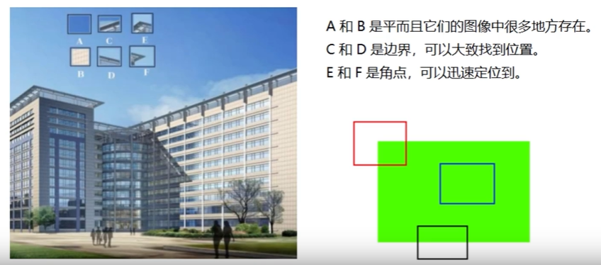
七、图像金字塔与轮廓检测 七、图像金字塔与轮廓检测1. 图像轮廓(1)概念cv2.findContours(img, mode, method)mode(轮廓检测模式):RETR_EXTERNAL:只检测最外面的轮廓RETR_LIST:检测所有的轮廓,并将其保存到链表中RETR_CCOMP:检索所有的轮廓,并将他们组织为两层,第一层为各部分的外部边界,第二层为空洞的边界RETR_TREE:检索所有的轮廓,并重构嵌套轮廓的整个层次method(轮廓逼近的方法):CHAIN_APPROX_NONE:以 Freeman 链码的方式输出轮廓,所有其他方法输出多边形(顶点的序列)CHAIN_APPROX_SIMPLE:压缩水平的、垂直的和斜的部分,即函数只保留他们的终点部分import cv2 # OpenCV 读取的格式是 BGR import matplotlib.pyplot as plt import numpy as np %matplotlib inline img = cv2.imread('ysg.png') gray = cv2.cvtColor(img, cv2.COLOR_BGR2GRAY) # 使用二值图像提高准确率 ret, thresh = cv2.threshold(gray, 127, 255, cv2.THRESH_BINARY) plt.imshow(thresh, cmap='gray') plt.show()binary, contours, hierarchy = cv2.findContours(thresh, cv2.RETR_TREE, cv2.CHAIN_APPROX_NONE)(2)轮廓绘制img_cp = img.copy() # 参数:需绘制的图像,轮廓(-1为绘制所有轮廓),颜色模式,线条厚度 res = cv2.drawContours(img_cp, contours, -1, (0, 0, 255), 1) plt.imshow(cv2.cvtColor(res, cv2.COLOR_BGR2RGB)) plt.show()(3)轮廓特征cnt = contours[0] # 面积 cv2.contourArea(cnt) 136.0# 周长,True表示闭合 cv2.arcLength(cnt, True) 49.656854152679442. 模板匹配(1)概念模板匹配类似于卷积原理,模板在原图像上从原点开始滑动,计算模板与(图像被覆盖的地方)的差别程度(OpenCV中共6种计算方法),然后将每一次计算结果放入一个矩阵,作为结果输出。6种计算方法:TM_SQDIFF:计算平方不同,计算结果值越小,越相关TM_CCORR:计算相关性,计算结果值越大,越相关TM_CCOEFF:计算相关系数,计算结果值越大,越相关TM_SQDIFF_NORMED:计算归一化平方不同,计算结果值越接近0,越相关TM_CCORR_NORMED:计算归一化相关性,计算结果值越接近1,越相关TM_CCOEFF_NORMED:计算归一化相关系数,计算结果值越接近1,越相关如:原图像大小为 A x B,模板大小为 a x b,则输出结果矩阵是(A - a + 1) x (B - b + 1)img = cv2.imread('ysg.png', 0) template = cv2.imread('ysg_template.png', 0) h, w = template.shape[:2]img.shape (310, 341)template.shape (161, 144)res = cv2.matchTemplate(img, template, cv2.TM_SQDIFF) res.shape (150, 198)min_val, max_val, min_loc, max_loc = cv2.minMaxLoc(res) # 最小值 min_val 0.0 # 最大值 max_val 217423616.0 # 最小值位置 min_loc (67, 10) # 最大值位置 max_loc (189, 97)(2)示例methods = ['cv2.TM_SQDIFF', 'cv2.TM_CCORR', 'cv2.TM_CCOEFF', 'cv2.TM_SQDIFF_NORMED', 'cv2.TM_CCORR_NORMED', 'cv2.TM_CCOEFF_NORMED'] for item in methods: img_copy = img.copy() # 匹配方法的真值 method = eval(item) print(method) res = cv2.matchTemplate(img, template, method) min_val, max_val, min_loc, max_loc = cv2.minMaxLoc(res) # 如果平方差匹配TM_SQDIFF,或归一化平方差匹配TM_SQDIFF_NORMED,取最小值 if method in [cv2.TM_SQDIFF, cv2.TM_SQDIFF_NORMED]: top_left = min_loc else: top_left = max_loc bottom_right = (top_left[0] + w, top_left[1] + h) cv2.rectangle(img_copy, top_left, bottom_right, 255, 2) plt.subplot(121), plt.imshow(res, cmap='gray') plt.xticks([]), plt.yticks([]) plt.subplot(122), plt.imshow(img_copy, cmap='gray') plt.xticks([]), plt.yticks([]) plt.suptitle(item) plt.show()# 匹配多个对象 match = cv2.imread('ysg_match.png') match_gray = cv2.cvtColor(match, cv2.COLOR_BGR2GRAY) template = cv2.imread('ysg_template.png', 0) h, w = template.shape[:2] res = cv2.matchTemplate(match_gray, template, cv2.TM_CCOEFF_NORMED) threshold = 0.8 loc = np.where(res >= threshold) # 筛选匹配程度大于等于80%的 for pt in zip(*loc[::-1]): bottom_right = (pt[0] + w, pt[1] + h) cv2.rectangle(match, pt, bottom_right, (0, 0, 255), 1) plt.imshow(cv2.cvtColor(match, cv2.COLOR_BGR2RGB)) plt.show()3. 图像金字塔高斯金字塔向下采样(缩小)# 向下采样 img_down = cv2.pyrDown(img) plt.imshow(cv2.cvtColor(img_down, cv2.COLOR_BGR2RGB)) plt.show()img.shape (310, 341, 3) img_down.shape (155, 171, 3)向上采样(放大)# 向上采样 img = cv2.imread('ysg.png') img_up = cv2.pyrUp(img) plt.imshow(cv2.cvtColor(img_up, cv2.COLOR_BGR2RGB)) plt.show()img.shape (310, 341, 3) img_up.shape (620, 682, 3)拉普拉斯金字塔img = cv2.imread('ysg.png') down = cv2.pyrDown(img) down_up = cv2.pyrUp(down) if img.shape != down_up.shape: img = cv2.resize(img, (down_up.shape[1], down_up.shape[0])) res = img - down_up plt.imshow(cv2.cvtColor(res, cv2.COLOR_BGR2RGB)) plt.show()4. 轮廓近似outline = cv2.imread('outline.png') gray = cv2.cvtColor(outline, cv2.COLOR_BGR2GRAY) ret, thresh = cv2.threshold(gray, 127, 255, cv2.THRESH_BINARY) binary, contours, hierarchy = cv2.findContours(thresh, cv2.RETR_TREE, cv2.CHAIN_APPROX_NONE) cnt = contours[0] outline_cp = outline.copy() res = cv2.drawContours(outline_cp, [cnt], -1, (0, 0, 255), 2) plt.imshow(cv2.cvtColor(res, cv2.COLOR_BGR2RGB)) plt.show()# 值越小,越接近原始轮廓 epsilon = 0.1 * cv2.arcLength(cnt, True) approx = cv2.approxPolyDP(cnt, epsilon, True) outline_cp1 = outline.copy() res = cv2.drawContours(outline_cp1, [approx], -1, (0, 0, 255), 2) plt.imshow(cv2.cvtColor(res, cv2.COLOR_BGR2RGB)) plt.show()5. 边界矩形outline = cv2.imread('outline.png') gray = cv2.cvtColor(outline, cv2.COLOR_BGR2GRAY) ret, thresh = cv2.threshold(gray, 127, 255, cv2.THRESH_BINARY) binary, contours, hierarchy = cv2.findContours(thresh, cv2.RETR_TREE, cv2.CHAIN_APPROX_NONE) cnt = contours[0] x, y, w, h = cv2.boundingRect(cnt) res = cv2.rectangle(outline, (x, y), (x + w, y + h), (0, 0, 255), 2) plt.imshow(cv2.cvtColor(res, cv2.COLOR_BGR2RGB)) plt.show()# 轮廓面积与边界矩形比 area = cv2.contourArea(cnt) x, y, w, h = cv2.boundingRect(cnt) rect_area = w * h extent = float(area) / rect_area print(extent) 0.50601736972704716. 外接圆(x, y), radius = cv2.minEnclosingCircle(cnt) center = (int(x), int(y)) radius = int(radius) res = cv2.circle(res, center, radius, (0, 0, 255), 2) plt.imshow(cv2.cvtColor(res, cv2.COLOR_BGR2RGB)) plt.show()