
搜索到
2
篇与
的结果
-
 渐变 1. 线性渐变<!DOCTYPE html> <html lang="zh-CN"> <head> <meta charset="UTF-8"> <title>线性渐变</title> <style> .box { width: 300px; height: 200px; border: 1px solid black; float: left; margin-left: 50px; font-size: 40px; } .box1 { background-image: linear-gradient(red, yellow, green); } .box2 { background-image: linear-gradient(to right top, red, yellow, green); } .box3 { background-image: linear-gradient(20deg, red, yellow, green); } .box4 { background-image: linear-gradient(red 50px, yellow 100px, green 150px); } .box5 { background-image: linear-gradient(20deg, red 50px, yellow 100px, green 150px); font-size: 80px; text-align: center; line-height: 200px; font-weight: bold; color: transparent; background-clip: text; } </style> </head> <body> <div class="box box1">默认情况(从上到下)</div> <div class="box box2">通过关键词调整线性渐变方向</div> <div class="box box3">通过角度调整线性渐变方向</div> <div class="box box4">调整线性渐变的区域</div> <div class="box box5">带带大师兄</div> </body> </html>2. 径向渐变<!DOCTYPE html> <html lang="zh-CN"> <head> <meta charset="UTF-8"> <title>径向渐变</title> <style> .box { width: 300px; height: 200px; border: 1px solid black; float: left; margin-left: 50px; font-size: 40px; } .box1 { background-image: radial-gradient(red, yellow, green); } .box2 { background-image: radial-gradient(at right top, red, yellow, green); } .box3 { background-image: radial-gradient(at 100px 50px, red, yellow, green); } .box4 { background-image: radial-gradient(circle, red, yellow, green); } .box5 { background-image: radial-gradient(100px 100px, red, yellow, green); } .box6 { background-image: radial-gradient(red 50px, yellow 100px, green 200px); } .box7 { background-image: radial-gradient(100px 50px at 150px 150px, red 50px, yellow 100px, green 200px); } </style> </head> <body> <div class="box box1">默认情况</div> <div class="box box2">通过关键词调整径向渐变圆的圆心</div> <div class="box box3">通过像素值调整径向渐变圆的圆心</div> <div class="box box4">通过关键字circle调整为正圆</div> <div class="box box5">通过像素值调整为正圆</div> <div class="box box6">调整径向渐变的区域</div> <div class="box box7">综合写法</div> </body> </html>3. 重复渐变<!DOCTYPE html> <html lang="zh-CN"> <head> <meta charset="UTF-8"> <title>重复渐变</title> <style> .box { width: 300px; height: 200px; border: 1px solid black; float: left; margin-left: 50px; font-size: 40px; } .box1 { background-image: repeating-linear-gradient(red 50px, yellow 100px, green 150px); } .box2 { background-image: repeating-radial-gradient(red 50px, yellow 100px, green 200px); } </style> </head> <body> <div class="box box1">重复线性渐变</div> <div class="box box2">重复径向渐变</div> </body> </html>
 -
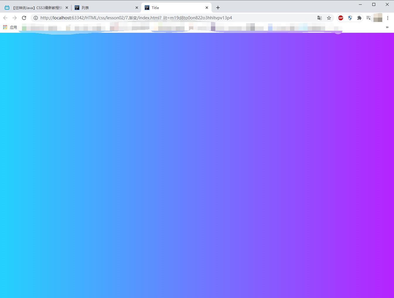
美化网页(CSS) 1.1 字体样式<!-- font-family:字体 font-size:大小 font-weight: 字体粗细 --> <style> body{ font-family: "Agency FB",楷体; color: #5f85ff; } h1{ font-size: 50px; } .p1{ font-weight: inherit; } </style>1.2 文本样式1、颜色 color rgb rgba2、文本对齐方式 text-align:center3、首行缩进 text-indent:2em4、行高 line-height(单行文字上下居中 line-height = height)5、装饰 text-decoration6、文本图片水平对齐 vertical-align: middle;<!DOCTYPE html> <html lang="en"> <head> <meta charset="UTF-8"> <title>Title</title> <!-- 颜色: RGB 0~F RGBA A:0~1 text-align: 排版 text-indent: 2em;段落首行缩进 line-height: 30px; 行高 行高 和 块的高度一致,就可以上下居中 --> <style> h1{ color: rgba(0,255,255,0.8); text-align: center; } .p1{ text-indent: 2em; } .p2{ background: #5f85ff; height: 50px; line-height: 50px; } /* underline:下划线 line-through:中划线 overline:上划线 */ .p3{ text-decoration: underline; } .p4{ text-decoration: line-through; } .p5{ text-decoration: overline; } /*超链接去下划线*/ a{ text-decoration: none; } /*文字图片水平对齐*/ img,p{ vertical-align: middle; } </style> </head> <body> <h1>棕熊盖房子</h1> <p class="p1"> 冬天快来了,棕熊想:我要在森林里盖一座房子,这样冬天我就不用睡在外面,就可以呆在自己的屋子里一边吃东西,一边读自己喜欢读的书了! </p> <p class="p2"> 冬天快来了,棕熊想:“我要在森林里盖一座房子,这样冬天我就不用睡在外面,就可以呆在自己的屋子里一边吃东西,一边读自己喜欢读的书了!”不过,怎么盖呢?盖成什么样子呢? 棕熊想:“我该请别的朋友给我出出主意!” </p> <br/> <p class="p3">123321</p> <p class="p4">123321</p> <p class="p5">123321</p> <a href="#">123321</a> <p> <img src="../3.文本样式/image/1.png" width="900px" height="805" alt=""> <span>无间道</span> </p> </body> </html>1.3 阴影/*text-shadow:水平偏移,垂直偏移,阴影半径,颜色*/ #price{ text-shadow:5px 5px 2px lightblue; }1.4 超链接伪类常用的 a,a:hover/*默认颜色*/ a{ text-decoration: none; color:black; } /*鼠标悬浮的状态*/ a:hover{ color: #5f85ff; font-size: 24px; } /*鼠标按住未释放的状态*/ a:active{ color: orange; } /*已访问的链接*/ a:visited{ color: #ff23bd; }1.5 列表/*ul,li*/ /* list-style: none;去掉无序列表圆点 circle 空心圆 decimal 数字 */ ul li{ height: 30px; list-style: none; text-indent: 1em; }1.6 背景背景颜色背景图片 <style> div{ width: 1000px; height: 700px; border: 1px solid red; /*默认全部平铺*/ background-image: url("image/1.JPG"); } .div1{ background-repeat: repeat-x; } .div2{ background-repeat: repeat-y; } .div3{ background-repeat: no-repeat; } </style>1.7 渐变background: linear-gradient(19deg, #21D4FD 0%, #B721FF 100%);