
搜索到
113
篇与
的结果
-
 React - 事件绑定 1. 基础事件绑定语法:on + 事件名称 = { 事件处理方法/函数 }function App() { const clickHandler = () => { alert('事件绑定') } return ( <div className="App"> <button onClick={clickHandler}>Click</button> </div> ) } export default App 2. 使用事件对象参数function App() { const clickHandler = (e) => { alert('事件绑定') console.log('事件参数', e) } return ( <div className="App"> <button onClick={clickHandler}>Click</button> </div> ) } export default App 3. 传递自定义参数语法:绑定事件时改造为箭头函数(通过函数引用的方式实现),通过形参传递function App() { const clickHandler = (name) => { console.log('自定义参数', name) } return ( <div className="App"> <button onClick={() => clickHandler('孙笑川')}>Click</button> </div> ) } export default App 4. 同时传递事件对象和自定义参数语法:在绑定事件的位置传递事件实参 e,clickHandler 中声明形参,且需要注意参数的顺序function App() { const clickHandler = (name, e) => { console.log('自定义参数', name, '事件参数', e) } return ( <div className="App"> <button onClick={(e) => clickHandler('孙笑川', e)}>Click</button> </div> ) } export default App
 -
React - 简介、JSX基础 一、搭建开发环境官网快速开始文档 - 创建一个 React 项目:https://18.react.dev/learn/creating-a-react-appnpx create-react-app react-demo npm start二、JSX 基础1. 概念JSX(JS的语法扩展)是JavaScript 和 XML(HTML)的缩写,表示在 js 代码中编写 HTML 模板结构,它是 React 中编写 UI 模板的方式2. 使用 js 表达式在 JSX 中可以通过大括号语法 {} 识别 js 中的表达式,如:变量、函数调用、方法调用等使用引号传递字符串使用 js 变量函数调用和方法调用使用 js 对象const index = 1 function getName() { return '孙笑川' } function App() { return ( <div className="App"> 这是 React Demo {/* 使用引号传递字符串 */} {'这是 React Demo'} {/* 使用 js 变量 */} {index} {/* 函数调用 */} {getName()} {/* 方法调用 */} {new Date().getDate()} {/* 使用js对象 */} <div style={{ color: 'red' }}>这是 React Demo</div> </div> ); } export default App; 3. 列表渲染const list = [ {id: '1', name: '孙笑川'}, {id: '2', name: '药水哥'}, {id: '3', name: '刘波'} ] function App() { return ( <div className="App"> {/* 渲染列表 */} <ul> {list.map(item => <li key={item.id}>{item.name}</li>)} </ul> </div> ); } export default App; 4. 条件渲染通过逻辑运算符、三元表达式实现基础的条件渲染const flag = true function App() { return ( <div className="App"> {/* 逻辑运算 */} {flag && <span>这是 span 标签</span>} {/* 三元运算 */} {!flag ? <span>这是 span 标签</span> : <p>这是 p 标签</p>} </div> ); } export default App; 5. 复杂条件渲染通过自定义函数 + if 判断语句实现const type = 1 // 0 1 2 function getType() { if (type === 0) { return <div>孙笑川</div> } if (type === 1) { return <div>药水哥</div> } if (type === 2) { return <div>刘波</div> } } function App() { return ( <div className="App"> {/* 复杂条件渲染 */} {getType()} </div> ); } export default App;
-
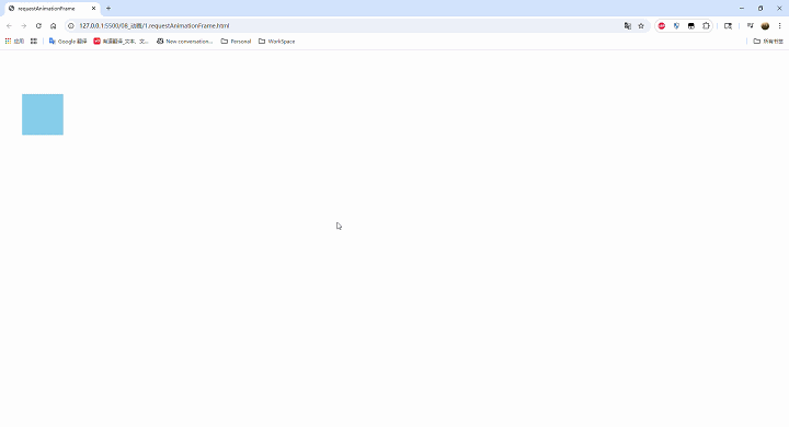
动画 1. requestAnimationFrame<!DOCTYPE html> <html lang="en"> <head> <meta charset="UTF-8"> <meta name="viewport" content="width=device-width, initial-scale=1.0"> <title>requestAnimationFrame</title> </head> <body> <script> // 1.创建 canvas 画布 const canvas = document.createElement('canvas') // 设置宽高 canvas.width = 500 canvas.height = 500 document.body.append(canvas) // 2.获取 context 对象(画笔) const context = canvas.getContext('2d') context.fillStyle = 'skyblue' // 画一个方形,使之随时间左右移动 // 调用 requestAnimationFrame 函数,使函数循环执行 let x = 0 function loop() { context.clearRect(0, 0, canvas.width, canvas.height) context.fillRect(x, 100, 100, 100, 100) x += 1 requestAnimationFrame(loop) } requestAnimationFrame(loop) </script> </body> </html>2. 环绕动画 - 行星运动<!DOCTYPE html> <html lang="en"> <head> <meta charset="UTF-8"> <meta name="viewport" content="width=device-width, initial-scale=1.0"> <title>环绕动画-行星运动</title> <style> canvas { background-color: #4d5053; /* color: #4d5053; */ } </style> </head> <body> <script> // 1.创建 canvas 画布 const canvas = document.createElement('canvas') // 设置宽高 canvas.width = 500 canvas.height = 500 document.body.append(canvas) // 2.获取 context 对象(画笔) const context = canvas.getContext('2d') // 地球旋转的角度 let earthAngle = 0 // 月球旋转的角度 let moonAngle = 0 function loop() { context.save() context.clearRect(0, 0, canvas.width, canvas.height) // 太阳 context.beginPath() context.arc(250, 250, 60, 0, 2 * Math.PI) context.fillStyle = '#f1ce07' context.shadowColor = '#f1ce07' context.shadowBlur = 10 context.fill() context.closePath() // 地球 // 1. 将canvas的原点移至太阳的中心 context.beginPath() context.translate(250, 250) context.rotate(earthAngle * Math.PI / 180) // 2. 将canvas的原点移至地球的中心(使日-地-月的中心在一条水平线上) context.translate(170, 0) context.arc(0, 0, 15, 0, 2 * Math.PI) context.fillStyle = 'blue' context.shadowBlur = 0 context.fill() earthAngle += 0.3 context.closePath() // 月亮 context.beginPath() context.rotate(moonAngle * Math.PI / 180) context.arc(35, 0, 6, 0, 2 * Math.PI) context.fillStyle = 'white' context.shadowBlur = 0 context.fill() moonAngle += 1.3 context.closePath() context.restore() requestAnimationFrame(loop) } requestAnimationFrame(loop) </script> </body> </html>
-
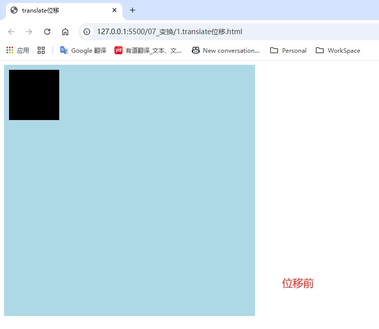
变换 1. translate 位移<!DOCTYPE html> <html lang="en"> <head> <meta charset="UTF-8"> <meta name="viewport" content="width=device-width, initial-scale=1.0"> <title>translate位移</title> <style> canvas { background-color: lightblue; display: block; margin: auto; } </style> </head> <body> <script> // 1.创建 canvas 画布 const canvas = document.createElement('canvas') // 设置宽高 canvas.width = 500 canvas.height = 500 document.body.append(canvas) // 2.获取 context 对象(画笔) const context = canvas.getContext('2d') // 位移(基于原点的变换) context.translate(100, 100) context.fillRect(10, 10, 100, 100) </script> </body> </html>2. rotate 旋转<!DOCTYPE html> <html lang="en"> <head> <meta charset="UTF-8"> <meta name="viewport" content="width=device-width, initial-scale=1.0"> <title>rotate旋转</title> <style> canvas { background-color: lightblue; } </style> </head> <body> <script> // 1.创建 canvas 画布 const canvas = document.createElement('canvas') // 设置宽高 canvas.width = 500 canvas.height = 500 document.body.append(canvas) // 2.获取 context 对象(画笔) const context = canvas.getContext('2d') // 位移(基于原点的变换) context.translate(200, 200) context.rotate(45 * Math.PI / 180) context.fillRect(10, 10, 100, 100) </script> </body> </html>3. scale 缩放<!DOCTYPE html> <html lang="en"> <head> <meta charset="UTF-8"> <meta name="viewport" content="width=device-width, initial-scale=1.0"> <title>缩放</title> <style> canvas { background-color: lightblue; } </style> </head> <body> <script> // 1.创建 canvas 画布 const canvas = document.createElement('canvas') // 设置宽高 canvas.width = 500 canvas.height = 500 document.body.append(canvas) // 2.获取 context 对象(画笔) const context = canvas.getContext('2d') // 缩放 context.scale(1.1, 2) context.fillRect(10, 10, 100, 100) </script> </body> </html>4. transform<!DOCTYPE html> <html lang="en"> <head> <meta charset="UTF-8"> <meta name="viewport" content="width=device-width, initial-scale=1.0"> <title>transform</title> <style> canvas { background-color: lightblue; } </style> </head> <body> <script> // 1.创建 canvas 画布 const canvas = document.createElement('canvas') // 设置宽高 canvas.width = 500 canvas.height = 500 document.body.append(canvas) // 2.获取 context 对象(画笔) const context = canvas.getContext('2d') /* transform(a, b, c, d, e, f) 该方法集位移、旋转、缩放为一体 a 水平缩放 b 垂直倾斜 c 水平倾斜 d 垂直缩放 e 水平移动 f 垂直移动 */ context.transform(1.1, 45 * Math.PI / 180, 30 * Math.PI / 180, 1.4, 100, 100) context.fillRect(10, 10, 100, 100) </script> </body> </html>
-
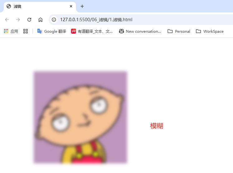
滤镜 <!DOCTYPE html> <html lang="en"> <head> <meta charset="UTF-8"> <meta name="viewport" content="width=device-width, initial-scale=1.0"> <title>滤镜</title> </head> <body> <script> // 1.创建 canvas 画布 const canvas = document.createElement('canvas') // 设置宽高 canvas.width = 500 canvas.height = 500 document.body.append(canvas) // 2.获取 context 对象(画笔) const context = canvas.getContext('2d') // 滤镜 // context.filter = 'none' // 默认值 // context.filter = 'blur(5px)' // 模糊 // context.filter = 'brightness(70%)' // 亮度 // context.filter = 'contrast(25%)' // 对比度 // context.filter = 'grayscale(60%)' // 灰度 // context.filter = 'hue-rotate(100deg)' // 色彩旋转 // context.filter = 'invert(60%)' // 透明度 // context.filter = 'opacity(60%)' // 反相 // context.filter = 'saturate(300%)' // 饱和度 context.filter = 'sepia(300%)' // 褐度 const img = new Image() img.src = './images/test.jpg' img.onload = function() { context.drawImage(img, 100, 100) } </script> </body> </html>
-
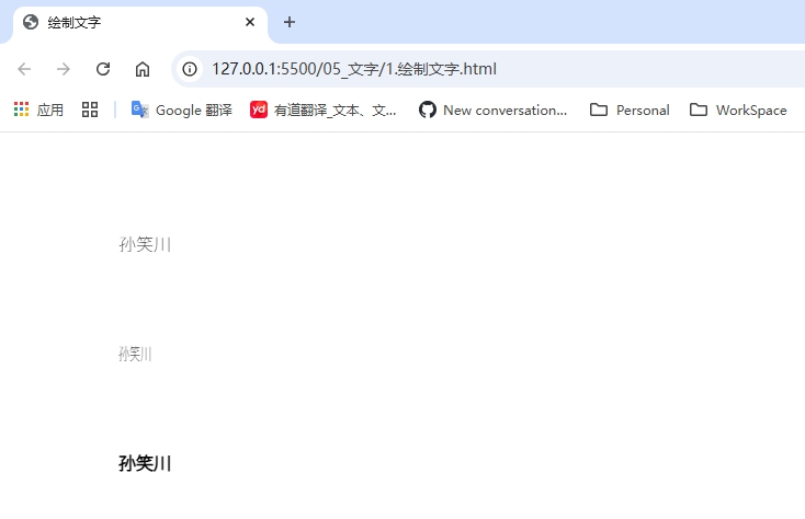
文字 (1)绘制文字<!DOCTYPE html> <html lang="en"> <head> <meta charset="UTF-8"> <meta name="viewport" content="width=device-width, initial-scale=1.0"> <title>绘制文字</title> </head> <body> <script> // 1.创建 canvas 画布 const canvas = document.createElement('canvas') // 设置宽高 canvas.width = 500 canvas.height = 500 document.body.append(canvas) // 2.获取 context 对象(画笔) const context = canvas.getContext('2d') // 文字属性 context.font = '200 16px Arial' // fillText(content, x, y, [maxWidth]) // 注:x, y为文字的左下角初始坐标 context.fillText('孙笑川', 100, 100) // maxWidth 属性一般不使用 context.fillText('孙笑川', 100, 200, 30) // strokeText(content, x, y, [maxWidth]) context.strokeText('孙笑川', 100, 300) </script> </body> </html>(2)绘制渐变的文字<!DOCTYPE html> <html lang="en"> <head> <meta charset="UTF-8"> <meta name="viewport" content="width=device-width, initial-scale=1.0"> <title>绘制渐变的文字</title> </head> <body> <script> // 1.创建 canvas 画布 const canvas = document.createElement('canvas') // 设置宽高 canvas.width = 500 canvas.height = 500 document.body.append(canvas) // 2.获取 context 对象(画笔) const context = canvas.getContext('2d') // 文字属性 context.font = 'italic 40px Arial' // 渐变 let gradient = context.createLinearGradient(0, 0, 500, 0) gradient.addColorStop(0, 'yellow') gradient.addColorStop(0.25, 'orange') gradient.addColorStop(0.5, 'skyblue') gradient.addColorStop(0.75, 'purple') gradient.addColorStop(1, 'red') context.fillStyle = gradient // fillText(content, x, y, [maxWidth]) // 注:x, y为文字的左下角初始坐标 context.fillText('孙笑川', 100, 100) // maxWidth 属性一般不使用 context.fillText('孙笑川', 100, 200, 30) context.strokeStyle = gradient // strokeText(content, x, y, [maxWidth]) context.strokeText('孙笑川', 100, 300) </script> </body> </html>(3)文字的横向对齐方式<!DOCTYPE html> <html lang="en"> <head> <meta charset="UTF-8"> <meta name="viewport" content="width=device-width, initial-scale=1.0"> <title>文字的横向对齐方式</title> </head> <body> <script> // 1.创建 canvas 画布 const canvas = document.createElement('canvas') // 设置宽高 canvas.width = 500 canvas.height = 500 document.body.append(canvas) // 2.获取 context 对象(画笔) const context = canvas.getContext('2d') // 辅助中线 context.strokeStyle = 'black' context.moveTo(250, 0) context.lineTo(250, 500) context.stroke() // 文字属性 context.font = 'italic 24px Arial' // 方向控制 direction context.direction = 'ltr' // 默认为从左到右 // 对齐方式 textAlign // context.textAlign = 'left' // context.textAlign = 'right' // context.textAlign = 'center' // fillText(content, x, y, [maxWidth]) // 注:x, y为文字的左下角初始坐标 context.fillText('孙笑川', 250, 100) context.direction = 'rtl' // 默认为从左到右 // strokeText(content, x, y, [maxWidth]) context.strokeText('孙笑川', 250, 300) </script> </body> </html>(4)文字的纵向对齐方式<!DOCTYPE html> <html lang="en"> <head> <meta charset="UTF-8"> <meta name="viewport" content="width=device-width, initial-scale=1.0"> <title>文字的纵向对齐方式</title> </head> <body> <script> // 1.创建 canvas 画布 const canvas = document.createElement('canvas') // 设置宽高 canvas.width = 500 canvas.height = 500 document.body.append(canvas) // 2.获取 context 对象(画笔) const context = canvas.getContext('2d') const baselines = ['top', 'hanging', 'middle', 'alphabetic', 'ideographic'] context.font = '24px Arial' baselines.forEach((baseline, index) => { // 基线 context.textBaseline = baseline const y = 50 + index * 50 context.beginPath() context.moveTo(0, y + 0.5) context.lineTo(500, y + 0.5) context.stroke() context.fillText(`孙笑川(${baseline})`, 0, y) }) </script> </body> </html>
-
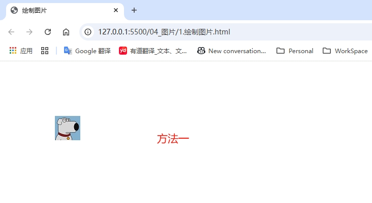
图片 1. 绘制图片<!DOCTYPE html> <html lang="en"> <head> <meta charset="UTF-8"> <meta name="viewport" content="width=device-width, initial-scale=1.0"> <title>绘制图片</title> </head> <body> <script> // 1.创建 canvas 画布 const canvas = document.createElement('canvas') // 设置宽高 canvas.width = 500 canvas.height = 500 document.body.append(canvas) // 2.获取 context 对象(画笔) const context = canvas.getContext('2d') // 3.1 准备图片 let img = new Image() img.src = './images/test.jpg' // 图片加载时需要一定的时间(该加载过程不会阻塞js进程),需等待加载完成,才能绘制 img.onload = function () { // 3.2 使用 drawImage 方法 // 方法一:传入绘制的坐标,按图片原有的大小绘制 // context.drawImage(img, 100, 100) // 方法二:传入绘制的坐标和渲染的大小(宽、高) // context.drawImage(img, 20, img.height) // 方法三:传入要裁切的区域,渲染到页面上 context.drawImage(img, 10, 20, 15, 25, 100, 100, 100, 100) } </script> </body> </html>2. 动画使用的精灵图素材宽1260,高300,分为7份<!DOCTYPE html> <html lang="en"> <head> <meta charset="UTF-8"> <meta name="viewport" content="width=device-width, initial-scale=1.0"> <title>动画</title> </head> <body> <script> // 1.创建 canvas 画布 const canvas = document.createElement('canvas') // 设置宽高 canvas.width = 500 canvas.height = 500 document.body.append(canvas) // 2.获取 context 对象(画笔) const context = canvas.getContext('2d') // 3.1 准备图片 let img = new Image() img.src = './images/sprite.png' // 图片加载时需要一定的时间(该加载过程不会阻塞js进程),需等待加载完成,才能绘制 img.onload = function () { let index = 0 setInterval(() => { context.clearRect(0, 0, canvas.width, canvas.height) context.drawImage(img, 180 * index, 0, 180, 300, 0, 0, 180, 300) index++ index %= 7 }, 100) } </script> </body> </html>
-
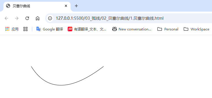
贝塞尔曲线 2. 贝塞尔曲线Canvas 提供了二阶和三阶的贝塞尔曲线方法:quadraticCurveTobezierCurveTo(1)二阶、三阶贝塞尔曲线<!DOCTYPE html> <html lang="en"> <head> <meta charset="UTF-8"> <meta name="viewport" content="width=device-width, initial-scale=1.0"> <title>贝塞尔曲线</title> </head> <body> <script> // 1.创建 canvas 画布 const canvas = document.createElement('canvas') // 设置宽高 canvas.width = 500 canvas.height = 500 document.body.append(canvas) // 2.获取 context 对象(画笔) const context = canvas.getContext('2d') // // 二阶贝塞尔曲线(第一个点是控制点) // // 3.1 起始点 // context.moveTo(100, 100) // // 3.2 调用 quadraticCurveTo 绘制二阶路径 // context.quadraticCurveTo(180, 230, 350, 100) // context.stroke() // 三阶贝塞尔曲线(第一、二个点是控制点) // 4.1 起始点 context.moveTo(100, 100) // 4.2 调用bezierCurveTo绘制三阶路径 context.bezierCurveTo(180, 210, 50, 280, 410, 360) context.stroke() </script> </body> </html>(2)使用 arcTo 绘制圆弧<!DOCTYPE html> <html lang="en"> <head> <meta charset="UTF-8"> <meta name="viewport" content="width=device-width, initial-scale=1.0"> <title>arcTo绘制圆弧</title> </head> <body> <script> // 1.创建 canvas 画布 const canvas = document.createElement('canvas') // 设置宽高 canvas.width = 500 canvas.height = 500 document.body.append(canvas) // 2.获取 context 对象(画笔) const context = canvas.getContext('2d') // arcTo 绘制圆弧 // 3.1 起始点 context.moveTo(100, 100) // 3.2 调用 arcTo 方法,第一、二个参数为控制点,第三个参数为圆弧半径 context.arcTo(180, 100, 180, 180, 50) context.stroke() </script> </body> </html>